Plugin XML Reference
In this guide
This page is a complete reference for the XML files used to define Indigo plugin configuration dialogs, devices, events, actions, and menu items, including all supported field types and attributes.
Configuration Dialogs
The Indigo plugin XML contains some structures that are used in the various component XML files. Devices, Events, Actions, and the PluginConfig each may describe some type of user interface, so we needed a simple description language that described the user interface elements and layout. So, for the first 3, we created an XML element called a ConfigUI (we’ll discuss the PluginConfig a bit later). Here’s an example for a device:
<ConfigUI>
    <SupportURL>http://www.yourdomain.com/plugin/ApplianceModule.html</SupportURL>
    <Field id="autoLabel"
            type="label"
            visibleBindingId="manualEntry"
            visibleBindingValue="false">
        <Label>First, put your device into linking mode.</Label>
    </Field>
    <Field id="exampleButton"
            type="button"
            tooltip="Click this button to start the automatic discovery process."
            visibleBindingId="manualEntry"
            visibleBindingValue="false">
        <Label>Then click this button:</Label>
        <Title>Find Node ID</Title>
        <Action>validPythonMethodName</Action>
    </Field>
    <Field id="nodeID"
            type="textfield"
            readonly="YES"
            visibleBindingId="manualEntry"
            visibleBindingValue="false">
        <Label>Node ID:</Label>
    </Field>
    <Field id="simpleSeparator1" type="separator"/>
    <Field type="checkbox"
            id="manualEntry"
            defaultValue="false">
        <Label>Manually Enter Node ID:</Label>
        <Description>(Not Recommended)</Description>
    </Field>
    <Field id="manualNodeID"
            type="textfield"
            visibleBindingId="manualEntry"
            visibleBindingValue="true">
        <Label>Enter Node ID:</Label>
    </Field>
</ConfigUI>
The ConfigUI definition will result in the following dialog being presented to the user:
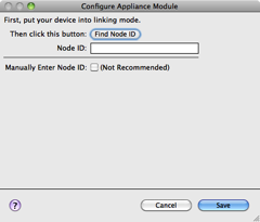
When each component type (device, event, action) needs a configuration user interface, and most will need some kind of configuration, it will have a ConfigUI element that describes the UI field elements along with a URL. When the user clicks on help button in the lower left corner (as shown above) their browser will be opened to the URL provided. If no URL is specified then the user will be directed to the main URL specified in the Info.plist file.
The rest of the elements in the ConfigUI represent fields that are shown in the dialog. We’ll go through each field type, starting with a screen shot of how it’s rendered, then the XML, and finally the details for each. The order in which you specify the fields is the order that they will show up in the dialog, and the id attribute is required for every field and must be unique within the dialog - it’s used to establish enabled and visible bindings between fields and more importantly it’s the key used in the dictionary to get the values when you get messages from the dialog (discussed more later). The id must be alphanumeric (and may contain underscores) and must begin with an alphabetic character.
You'll have the opportunity to validate the fields before they're saved (as well as know when the user cancels out of a dialog). How that's done is discussed at the end of this section.
Text Field
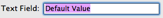
<Field id="simpleTextField" type="textfield" enabledBindingId="checkboxSample" defaultValue="Default Value">
    <Label>Text Field:</Label>
</Field>
A text field is use to collect text input from the user. The following table describes the attributes that are available for text fields.
| Attribute | Required | API Version | Notes |
|---|---|---|---|
alwaysUseInDialogHeightCalc |
No | 1.0 | For dialogs that contain hidden controls (see visibleBindingId and visibleBindingValue below), setting this attribute to true will force Indigo to take hidden controls into account when initially sizing the dialog box. This is useful when hidden controls become visible based on user input. |
defaultValue |
No | 1.0 | You can enter a default value here. |
enabledBindingId |
No | 1.0 (1.9) | If you want to conditionally enable/disable this field based on the value of a checkbox, set this value to the id of that field. API v1.9: You can also bind to a list field and this field will only be enabled if something is selected in the list. |
enabledBindingNegate |
No | 1.9 | Set this to "true" to negate the binding. So if the target binding field's value is true then the binding will be false. |
hidden |
No | 1.0 | If this attribute is set to true then the field will never be displayed regardless of what other options you have set for it. It’s useful if you need to contain some kind of state variables for the dialog that are controlled by button presses rather than controlled directly by the user. |
id |
Yes | 1.0 | This is a unique identifier for this Field within the context of this ConfigUI element. It must be alphanumeric (and may contain underscores) and must begin with an alphabetic character. |
readonly |
No | 1.0 | This attribute will make the field readonly - useful to show the user data that changes in some other way rather than being manipulated directly by the user - in the example above clicking the Find Node ID button will populate the ID field. |
secure |
No | 1.4 | If you specify true for this value then when the user types into the field the actual characters won't show but rather will be replaced with the bullet (•) character. The values typed into these fields are not stored securely - this will solely mask the value in the field from viewing in the UI. |
tooltip |
No | 1.0 | Unfortunately, disabled text fields won’t show tooltips (Cocoa limitation), so your tooltip should probably tell the user why it’s disabled (since that’s the only time it’ll show) if the field is ever disabled. |
type |
Yes | 1.0 | This must be textfield. |
visibleBindingId |
No | 1.0 | If you want to conditionally show/hide this field based on the value of another field, set this value to the id of another field. If you set this, you must also include a visibleBindingValue |
visibleBindingValue |
No | 1.0 | If you specify a visibleBindingId, you must specify the value(s) here. For instance, if you are binding to a checkbox, setting this to false will mean the text field is visible only when the checkbox is unchecked, and a true means the opposite. To make the field dependent on a list or menu, set this value to a comma separated list of option values (item1, item2). You can even bind it to the value in another text field, but that’s probably of limited use. Note: the string comparison is a contains - so if any option contains the specified string it will match. This offers some extra flexibility in defining dependency groups. |
A text field contains only one element: Label. This label is shown to the left of the field and is optional, although there are probably very few times when you won’t want a label. Labels are available on every Field type except for the separator.
Popup Menu

<Field type="menu" id="simplePopUpButton" defaultValue="item2">
    <Label>Popup Menu:</Label>
    <List>
        <Option value="item1">Item 1</Option>
        <Option value="item2">Item 2</Option>
        <Option value="item3">Item 3</Option>
    </List>
</Field>
Popup menu fields are used to select a single fixed value from a list with no inherent hierarchy. The following table describes the attributes that are available for menu fields.
| Attribute | Required | API Version | Notes |
|---|---|---|---|
alwaysUseInDialogHeightCalc |
No | 1.0 | For dialogs that contain hidden controls (see visibleBindingId and visibleBindingValue below), setting this attribute to true will force Indigo to take hidden controls into account when initially sizing the dialog box. This is useful when hidden controls become visible based on user input. |
defaultValue |
No | 1.0 (1.9) | You can enter a default value here. The value must be one of the values from the List element described below. API v1.9: If you specify a default value of "" (empty string) and there is no matching option, then the first menu item will be selected when the dialog is first run. This way you can avoid the user seeing "- no selection -" at the bottom of the menu. |
enabledBindingId |
No | 1.0 (1.9) | If you want to conditionally enable/disable this field based on the value of a checkbox, set this value to the id of that field. API v1.9: You can also bind to a list field and this field will only be enabled if something is selected in the list. |
enabledBindingNegate |
No | 1.9 | Set this to "true" to negate the binding. So if the target binding field's value is true then the binding will be false. |
hidden |
No | 1.0 | If this attribute is set to “true” then the field will never be displayed regardless of what other options you have set for it. It’s useful if you need to contain some kind of state variables for the dialog that are controlled by button presses rather than controlled directly by the user. |
id |
Yes | 1.0 | This is a unique identifier for this Field within the context of this ConfigUI element. It must be alphanumeric (and may contain underscores) and must begin with an alphabetic character. |
readonly |
No | 1.0 | This attribute will make the field readonly - useful to show the user data that changes in some other way rather than being manipulated directly by the user. |
tooltip |
No | 1.0 | Unfortunately, enabled menus won’t show tooltips (Cocoa limitation), so your tooltip should probably tell the user why it’s disabled (since that’s the only time it’ll show) if the field is ever disabled. |
type |
Yes | 1.0 | This must be “menu”. |
visibleBindingId |
No | 1.0 | If you want to conditionally show/hide this field based on the value of another field, set this value to the id of another field. If you set this, you must also include a visibleBindingValue |
visibleBindingValue |
No | 1.0 | If you specify a visibleBindingId, you must specify the value(s) here. For instance, if you are binding to a checkbox, setting this to false will mean the menu field is visible only when the checkbox is unchecked, and a true means the opposite. To make the field dependent on a list or another menu, set this value to a comma separated list of option values (“item1, item2”). You can even bind it to the value in a text field, but that’s probably of limited use. Note: the string comparison is a contains - so if any option contains the specified string it will match. This offers some extra flexibility in defining dependency groups. |
Static popup menu fields contain two elements. The first is the same Label element that every field has (except Separator which we’ll talk about later). The other is a List element which defines the menu items in your popup menu field. The List element contains multiple Option elements, each of which have a required value attribute. The value attribute is what is what will be passed back to your plugin when the dialog is validated; it may not contain comma characters. The text inside the Option element is what is displayed for each menu item in the user interface.
Like button fields, you can specify a CallbackMethod element in your field definition:
<Field type="menu" id="simplePopUpButton" defaultValue="item2">
    <Label>Popup Menu:</Label>
    <List>
        <Option value="item1">Item 1</Option>
        <Option value="item2">Item 2</Option>
        <Option value="item3">Item 3</Option>
    </List>
    <CallbackMethod>menuChanged</CallbackMethod>
</Field>
This method will be called every time the user changes the menu. The method in your plugin.py file should look something like this:
def menuChanged(self, valuesDict, typeId, devId):
    # do whatever you need to here
    #   typeId is the device type specified in the Devices.xml
    #   devId is the device ID - 0 if it's a new device
    return valuesDict
depending on which object type (plugin config, device, trigger, action, etc.) the dialog is being called for. This will allow you to adjust other fields in the valuesDict based on what's selected in the menu field. For instance, if you've selected a device type, you may decide to alter some hidden fields so that other fields are shown/and hidden. Used in combination with Dynamic Lists, you may also repopulate other lists with more appropriate values.
You may also specify a menu dynamically at runtime - that is, when the UI is shown, the client will call into your plugin to get the menu items. This will allow you to dynamically adjust the menu items every time the UI comes up. You can also specify some built-in dynamic items that the IndigoServer will provide automatically for you. See the Dynamic Lists section below for details.
List
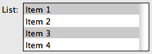
<Field type="list" id="listSample" defaultValue="item1,item3">
    <Label>List:</Label>
    <List>
        <Option value="item1">Item 1</Option>
        <Option value="item2">Item 2</Option>
        <Option value="item3">Item 3</Option>
        <Option value="item4">Item 4</Option>
    </List>
</Field>
List fields allow for the selection of 0-N items with no implicit hierarchy. The following table describes the attributes that are available for list fields.
| Attribute | Required | API Version | Notes |
|---|---|---|---|
alwaysUseInDialogHeightCalc |
No | 1.0 | For dialogs that contain hidden controls (see visibleBindingId and visibleBindingValue below), setting this attribute to true will force Indigo to take hidden controls into account when initially sizing the dialog box. This is useful when hidden controls become visible based on user input. |
defaultValue |
No | 1.0 | You can enter a default value here. The value must be a comma separated list of values, each value must be listed as an option in the List element. |
enabledBindingId |
No | 1.0 (1.9) | If you want to conditionally enable/disable this field based on the value of a checkbox, set this value to the id of that field. API v1.9: You can also bind to a list field and this field will only be enabled if something is selected in the list. |
enabledBindingNegate |
No | 1.9 | Set this to "true" to negate the binding. So if the target binding field's value is true then the binding will be false. |
hidden |
No | 1.0 | If this attribute is set to true then the field will never be displayed regardless of what other options you have set for it. It’s useful if you need to contain some kind of state variables for the dialog that are controlled by button presses rather than controlled directly by the user. |
id |
Yes | 1.0 | This is a unique identifier for this Field within the context of this ConfigUI element. It must be alphanumeric (and may contain underscores) and must begin with an alphabetic character. |
readonly |
No | 1.0 | This attribute will make the field readonly - useful to show the user data that changes in some other way rather than being manipulated directly by the user. |
rows |
No | 1.4 | Use this attribute to specify the number of rows that will show in the list. The minimum (and default) is 4. |
tooltip |
No | 1.0 | The tooltip will be shown when you hover over the actual list control. |
type |
Yes | 1.0 | This must be list. |
visibleBindingId |
No | 1.0 | If you want to conditionally show/hide this field based on the value of another field, set this value to the id of another field. If you set this, you must also include a visibleBindingValue |
visibleBindingValue |
No | 1.0 | If you specify a visibleBindingId, you must specify the value(s) here. For instance, if you are binding to a checkbox, setting this to false will mean the menu field is visible only when the checkbox is unchecked, and a true means the opposite. To make the field dependent on another list or menu, set this value to a comma separated list of Option values (item1, item2). You can even bind it to the value in a text field, but that’s probably of limited use. Note: the string comparison is a contains - so if any option contains the specified string it will match. This offers some extra flexibility in defining dependency groups. |
Static list fields are constructed almost identically to static popup menu fields - with a Label element and a List element which contains multiple Option elements. Each Option element must have a value attribute and that attribute is what is what will be passed back to your plugin when the dialog is validated; it may not contain comma or semicolon characters. The text inside the Option element is what is displayed for each line in the user interface.
As with menu fields, you may also specify a list dynamically at runtime - that is, when the UI is created, the client will call into your plugin to get the list items. This will allow you to dynamically adjust the list items every time the UI comes up. You can also specify some built-in dynamic items that the IndigoServer will provide automatically for you. See the Dynamic Lists section below for details.
Dynamic Lists
You may create dynamic menus and lists that are created at runtime. Indigo will supply some specific ones for you or your plugin may be called each time the UI is presented that will allow you to return anything you like.
To specify a dynamic list, you add some attributes to the List element and skip adding Option elements. To request any of the built-in lists, you specify a class attribute and (optionally) a filter attribute. For example, this field:
<Field id="insteonDimmers" type="menu">
    <Label>Insteon Dimmers:</Label>
    <List class="indigo.devices" filter="indigo.dimmer,indigo.insteon"/>
</Field>
would request a list of all Insteon dimmer devices. The list would be constructed with the device name as the menu or list item viewable by the user, and the value would be the device ID.
| Dynamic List Attributes | ||
|---|---|---|
| Attribute | Required | Notes |
class |
Yes | A reference to a class value as described below. The class attribute must be set to one or more of the built-in classes (listed below), or self. |
filter |
No | A filter attribute is not required, but if one is included, it must be set to a valid filter (see below) or empty filter="". |
method |
No | A reference to a plugin.py method that returns the list elements as described below. If not included, class must refer to one of the built-in methods (class="self" by itself will not work). |
Dynamic List Filters
The indigo.devices class specifies that the list will contain Indigo devices. If you don’t specify a filter, all devices defined by the user in Indigo will be returned. You can supply up to two filters if and only if one is an interface filter (see the first three in the list below). The filters are ANDed together, so one interface filter and one device type filter are the only combinations that will result in a non-empty list.
Class: indigo.devices |
|
|---|---|
| Optional Filters | Description |
indigo.zwave |
include Z-Wave devices - this is an interface filter that can be used with other filters |
indigo.insteon |
include Insteon devices - this is an interface filter that can be used with other filters |
indigo.x10 |
include X10 devices - this is an interface filter that can be used with other filters |
indigo.responder |
include devices whose state can be changed |
indigo.controller |
include devices that can send commands |
indigo.relay |
relay devices |
indigo.dimmer |
dimmer devices |
indigo.sprinkler |
sprinklers |
indigo.thermostat |
thermostats |
indigo.iodevice |
input/output devices |
indigo.sensor |
all sensor type devices: motion sensors, TriggerLinc, SynchroLinc (sensor devices that have a virtual state in Indigo) |
self |
all device types defined by the calling plugin |
self.devTypeId |
all devices of type deviceTypeId, where deviceTypeId is one of the device types specified by the calling plugin |
com.somePlugin |
all device types defined by some other plugin |
com.somePlugin.devTypeId |
all devices of type deviceTypeId, where deviceTypeId is one of the device types specified in some other plugin |
The indigo.triggers class specifies that the list will contain Indigo triggers. Only a single filter from the list below will return a useful list.
Class: indigo.triggers |
|
|---|---|
| Optional Filters | Description |
| indigo.insteonCmdRcvd | Insteon command received triggers |
| indigo.x10CmdRcvd | x10 command received triggers |
| indigo.devStateChange | device state changed triggers |
| indigo.varValueChange | variable changed triggers |
| indigo.serverStartup | startup triggers |
| indigo.powerFailure | power failure triggers |
| indigo.interfaceFail | interface failure triggers - can be used with or without a specified protocol |
| indigo.interfaceInit | interface connection triggers - can be used with or without a specified protocol |
| indigo.emailRcvd | email received triggers |
Using the indigo.schedules class will result in a list of all schedules, as will indigo.actionGroups and indigo.controlPages for their respective object types. None of these classes support any kind of filter. Lastly, indigo.variables will get you a list of variables. If you include filter="indigo.readWrite", you’ll get only variables for which you can change the value. Currently, there’s only one read-only variable (isDaylight) defined by the system, but it may be possible to create them in future versions of the API.
Another special built-in list is serial ports - use indigo.serialPorts to get a list of available serial ports, and what's returned to your plugin is the full path to the plugin (e.g. "/dev/tty*"). This is suitable for using with PySerial, which we include with Indigo. See the "serialport" field type below for an even better way of collecting serial communication information.
You may also include custom dynamic lists that are constructed on-the-fly by your plugin. If you defined your list like this:
<Field id="insteonDimmers" type="menu">
    <Label>Insteon Dimmers:</Label>
    <List class="self" filter="stuff" method="myListGenerator"/>
</Field>
Then your plugin will have the method specified called with the filter. For the above example, you must define a method like this:
def myListGenerator(self, filter="", valuesDict=None, typeId="", targetId=0):
    # From the example above, filter = "stuff"
    # You can pass anything you want in the filter for any purpose
    # Create a list where each entry is a list - the first item is
    # the value attribute and last is the display string that will
    # show up in the control. All parameters are read-only.
    myArray = [("option1", "First Option"),("option2","Second Option")]
    return myArray
Note
Both return tuple values should be strings. Specifically, items with None as the value (first item) will be skipped. Additionally, the first tuple value (option1 and option2 in the above example) must be a string that does not contain comma or semicolon characters.
The valuesDict parameter will contain the valuesDict for the object being edited - if it's a device config UI then it'll be the valuesDict from that device (just like what's passed in to validation methods), etc. Note: if it's a new object that hasn't been saved yet, valuesDict may be None or empty so test accordingly.
The typeId parameter will contain the type - for instance, if it's an event, it will be the event type id. The targetId is the ID of the object being edited. It will be 0 if it's a new object that hasn't been saved yet.
The field would then be created as if you had specified it statically like this:
<Field id="customList" type="menu">
    <Label>Select an Option:</Label>
    <List>
        <Option value="option1">First Option</Option>
        <Option value="option2">Second Option</Option>
    </List>
</Field>
This mechanism allows you to create any number of lists: devices dynamically discovered through some discovery protocol, calendars available, email addresses, iTunes playlists, etc.
One further option to dynamic lists is the ability to have them reload whenever the config dialog returns from a button or menu callback. So, for instance, if you have a button that somehow changes the contents of the dynamic list, you can specify the list as a one that's dynamically reloaded:
<Field id="insteonDimmers" type="menu">
    <Label>Insteon Dimmers:</Label>
    <List class="self" filter="stuff" method="myListGenerator" dynamicReload="true"/>
</Field>
Note
This will cause an extra round-trip (client->Indigo server->plugin->Indigo server->client) so you should only use this when the list can change while the dialog is actually running.
Serial Port
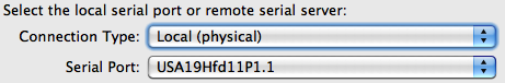
<Field type="serialport" id="devicePortFieldId" />
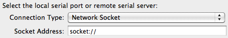
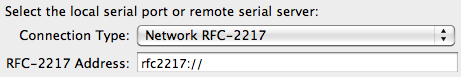
PySerial, the Python-based serial communication library that we ship with Indigo, supports not only doing traditional serial communications via physical serial connections, but also by doing serial communications over the network using serial over sockets or RFC 2217 (a standard for serial communication over the network). If the device you're connecting to supports one of these methods of connection then you can use the serialport field type. This allows you to specify a single field type that, when rendered in the UI, will expand to multiple fields that will allow the user to select Local (physical), Network Socket, or Network RFC-2217. Then, based on which option they select, we'll also present the other controls needed to completely select the connection method: a serial port list for the first or the hostname/ip address and port for the last two. Make sure you leave "socket://" or "rfc2217://" as the beginning of the address field for the last two.
This field type generates multiple controls in your dialog automatically. We've also included a helper method, validateSerialPortUi(valuesDict, errorsDict, u"devicePortFieldId") that will help you validate that the serialport control was used properly by the user. See the Validating Serialport Fields section for more information.
Checkbox

<Field type="checkbox" id="checkboxSample" defaultValue="true">
    <Label>Checkbox:</Label>
    <Description>What's on the right side of the checkbox</Description>
</Field>
Checkbox fields allow for binary selections (yes/no, true/false, etc). The following table describes the attributes that are available for checkbox fields.
| Attribute | Required | API Version | Notes |
|---|---|---|---|
alwaysUseInDialogHeightCalc |
No | 1.0 | For dialogs that contain hidden controls (see visibleBindingId and visibleBindingValue below), setting this attribute to true will force Indigo to take hidden controls into account when initially sizing the dialog box. This is useful when hidden controls become visible based on user input. |
defaultValue |
No | 1.0 | You can enter a default value here. The value must be either true or false. |
enabledBindingId |
No | 1.0 (1.9) | If you want to conditionally enable/disable this field based on the value of a checkbox, set this value to the id of that field. API v1.9: You can also bind to a list field and this field will only be enabled if something is selected in the list. |
enabledBindingNegate |
No | 1.9 | Set this to "true" to negate the binding. So if the target binding field's value is true then the binding will be false. |
hidden |
No | 1.0 | If this attribute is set to true then the field will never be displayed regardless of what other options you have set for it. It’s useful if you need to contain some kind of state variables for the dialog that are controlled by button presses rather than controlled directly by the user. |
id |
Yes | 1.0 | This is a unique identifier for this Field within the context of this ConfigUI element. |
readonly |
No | 1.0 | This attribute will make the field readonly - useful to show the user data that changes in some other way rather than being manipulated directly by the user. |
tooltip |
No | 1.0 | The tooltip will be shown when you hover over the actual list control. |
type |
Yes | 1.0 | This must be “checkbox”. |
visibleBindingId |
No | 1.0 | If you want to conditionally show/hide this field based on the value of another field, set this value to the id of another field. If you set this, you must also include a visibleBindingValue |
visibleBindingValue |
No | 1.0 | If you specify a visibleBindingId, you must specify the value(s) here. For instance, if you are binding to a checkbox, setting this to false will mean the menu field is visible only when the checkbox is unchecked, and a true means the opposite. To make the field dependent on another list or menu, set this value to a comma separated list of option values (item1, item2). You can even bind it to the value in a text field, but that’s probably of limited use. Note: the string comparison is a contains - so if any option contains the specified string it will match. This offers some extra flexibility in defining dependency groups. |
Checkboxes contain the standard required Label element. They also contain an optional element, Description, that’s used to deliver extra information on the right side of the checkbox. Many checkboxes may not need this extra information.
Like button fields, you can specify a CallbackMethod element in your field definition:
<Field type="checkbox" id="myCheckbox">
    <Label>Here's a checkbox:</Label>
    <CallbackMethod>checkboxChanged</CallbackMethod>
</Field>
This method will be called every time the user clicks the checkbox. The method in your plugin.py file should look something like this:
def checkboxChanged(self, valuesDict, typeId, devId):
    # do whatever you need to here
    #   typeId is the device type specified in the Devices.xml
    #   devId is the device ID - 0 if it's a new device
    return valuesDict
Label

<Field id="exampleLabel" type="label">
    <Label>This is where you can put your label text. If need be it'll wrap.
    </Label>
</Field>
Label fields are used to present text that span the width of the dialog. As you may have noticed, each control has an element called Label (with the exception of Separator, discussed next). When the dialog is displayed, each of those Label elements is right aligned and the actual control is left aligned directly to the right of the label. This field gives you a way to communicate a much longer chunk of text - like instructions, etc. It will actually span the entire width of the dialog and will wrap as necessary. The following table describes the attributes that are available for label fields.
| Attribute | Required | API Version | Notes |
|---|---|---|---|
alignText |
No | 1.4 | This will control how the label text is justified. Valid options are: "left" (default), "center", and "right". |
alignWithControl |
No | 1.4 | If set to "true", this will align the left margin of the label with the left margin for the actual controls (not their labels). Anything other than "true" will be considered "false" (which is also the default if not specified). This is very useful in conjunction with specifying font characteristics described below when you want to add some help specific to a control - just insert the label right below the control field and it will align with the actual control above. |
alwaysUseInDialogHeightCalc |
No | 1.0 | For dialogs that contain hidden controls (see visibleBindingId and visibleBindingValue below), setting this attribute to true will force Indigo to take hidden controls into account when initially sizing the dialog box. This is useful when hidden controls become visible based on user input. |
enabledBindingId |
No | 1.0 (1.9) | If you want to conditionally enable/disable this field based on the value of a checkbox, set this value to the id of that field. API v1.9: You can also bind to a list field and this field will only be enabled if something is selected in the list. |
enabledBindingNegate |
No | 1.9 | Set this to "true" to negate the binding. So if the target binding field's value is true then the binding will be false. |
fontColor |
No | 1.4 | Use this attribute to control the color of the label text. Valid options are: "black (default), "darkgray", "red", "orange", "green", and "blue". |
fontSize |
No | 1.4 | Use this attribute to specify the size of the font. Valid options are: "regular" (default, same size as all other text in the dialog), "small, which is a point or two smaller, and "mini which is yet another point size or two smaller. |
id |
Yes | 1.0 | This is a unique identifier for this Field within the context of this ConfigUI element. |
type |
Yes | 1.0 | This must be label. |
visibleBindingId |
No | 1.0 | If you want to conditionally show/hide this field based on the value of another field, set this value to the id of another field. If you set this, you must also include a visibleBindingValue |
visibleBindingValue |
No | 1.0 | If you specify a visibleBindingId, you must specify the value(s) here. For instance, if you are binding to a checkbox, setting this to false will mean the menu field is visible only when the checkbox is unchecked, and a true means the opposite. To make the field dependent on another list or menu, set this value to a comma separated list of option values (item1, item2). You can even bind it to the value in a text field, but that’s probably of limited use. Note: the string comparison is a contains - so if any option contains the specified string it will match. This offers some extra flexibility in defining dependency groups. |
Labels have a single element, Label, that holds the text to be displayed. Note: in a label field type, the Label element is required. This field type is read-only, which means that you can't have an error message attached to it from a validation method or a button method (see below for details).
Separator

<Field id="simpleSeparator1"
        type="separator"
        visibleBindingId="checkboxSample"
        visibleBindingValue="1"/>
Separators work very similarly to labels, except that they just draw a nice embossed line. You can use it to separate sections of your config dialogs. Used in conjunction with the visible attributes, you can make whole sections appear and disappear based on other data in the dialog. The following table describes the attributes that are available for separator fields.
| Attribute | Required | API Version | Notes |
|---|---|---|---|
alwaysUseInDialogHeightCalc |
No | 1.0 | For dialogs that contain hidden controls (see visibleBindingId and visibleBindingValue below), setting this attribute to true will force Indigo to take hidden controls into account when initially sizing the dialog box. This is useful when hidden controls become visible based on user input. |
enabledBindingId |
No | 1.0 (1.9) | If you want to conditionally enable/disable this field based on the value of a checkbox, set this value to the id of that field. API v1.9: You can also bind to a list field and this field will only be enabled if something is selected in the list. |
enabledBindingNegate |
No | 1.9 | Set this to "true" to negate the binding. So if the target binding field's value is true then the binding will be false. |
id |
Yes | 1.0 | This is a unique identifier for this Field within the context of this ConfigUI element. |
type |
Yes | 1.0 | This must be separator. |
visibleBindingId |
No | 1.0 | If you want to conditionally show/hide this field based on the value of another field, set this value to the id of another field. If you set this, you must also include a visibleBindingValue |
visibleBindingValue |
No | 1.0 | If you specify a visibleBindingId, you must specify the value(s) here. For instance, if you are binding to a checkbox, setting this to false will mean the menu field is visible only when the checkbox is unchecked, and a true means the opposite. To make the field dependent on another list or menu, set this value to a comma separated list of option values (item1, item2). You can even bind it to the value in a text field, but that’s probably of limited use. Note: the string comparison is a contains - so if any option contains the specified string it will match. This offers some extra flexibility in defining dependency groups. |
Separators are the only field type that contain no Label element. In fact, they don’t contain any elements at all, which is why the Field element that represents it is self terminating (notice the forward slash just before the closing bracket for the opening Field tag). This field type is read-only, which means that you can't have an error message attached to it from a validation method or a button method (see below for details).
Button

<Field id="exampleButton"
        type="button"
        tooltip="Click this button to do something cool"
        visibleBindingId="checkboxSample"
        visibleBindingValue="1">
    <Label>Visible button's label:</Label>
    <Title>Visible Button Title</Title>
    <CallbackMethod>ConfigButtonPressed</CallbackMethod>
</Field>
Button fields allow your user to communicate with your plugin during configuration. The following table describes the attributes that are available for button fields.
| Attribute | Required | API Version | Notes |
|---|---|---|---|
alwaysUseInDialogHeightCalc |
No | 1.0 | For dialogs that contain hidden controls (see visibleBindingId and visibleBindingValue below), setting this attribute to true will force Indigo to take hidden controls into account when initially sizing the dialog box. This is useful when hidden controls become visible based on user input. |
enabledBindingId |
No | 1.0 (1.9) | If you want to conditionally enable/disable this field based on the value of a checkbox, set this value to the id of that field. API v1.9: You can also bind to a list field and this field will only be enabled if something is selected in the list. |
enabledBindingNegate |
No | 1.9 | Set this to "true" to negate the binding. So if the target binding field's value is true then the binding will be false. |
id |
Yes | 1.0 | This is a unique identifier for this Field within the context of this ConfigUI element. |
type |
Yes | 1.0 | This must be button. |
visibleBindingId |
No | 1.0 | If you want to conditionally show/hide this field based on the value of another field, set this value to the id of another field. If you set this, you must also include a visibleBindingValue |
visibleBindingValue |
No | 1.0 | If you specify a visibleBindingId, you must specify the value(s) here. For instance, if you are binding to a checkbox, setting this to false will mean the menu field is visible only when the checkbox is unchecked, and a true means the opposite. To make the field dependent on another list or menu, set this value to a comma separated list of option values (item1, item2). You can even bind it to the value in a text field, but that’s probably of limited use. Note: the string comparison is a contains - so if any option contains the specified string it will match. This offers some extra flexibility in defining dependency groups. |
Aside from the standard Label element, the button field also contains two other required elements. The first is the Title element - this is the string that is displayed inside the button. The other required element is the CallbackMethod element, which contains the name of a Python method in your code that’s called when the user presses the button. This field type is read-only, which means that you can't have an error message attached to it from a validation method or a button method (see below for details).
As an example, if your plugin needs to start listening for a specific network broadcast packet that a device sends when it’s in a special discover mode, then you probably only want to listen for that packet when the user actually makes the device start to broadcast. So, as in the example device dialog above, you instruct the user to press a button on the device, then have them click the button. This would give your plugin an opportunity to do something while the configuration dialog was up and return the results to the dialog.
The process flow is this:
- The user clicks on the button.
- A dictionary containing all the values of the fields in the dialog are sent to the method that you identify in the
<CallbackMethod>element. - Your plugin can then do whatever it needs to and it returns a the dictionary back to the dialog containing any field changes.
- The dialog will update the values (and enable/visible bindings appropriately) for any changed fields.
Each button's method signature will match the parameters that are used in the validation methods described below. For instance, if you specify a method called "beginPairing" in a button field of the <ConfigUI> XML for a device like this:
<Device type="custom" id="mediaserver">
    <Name>Music Server</Name>
    <ConfigUI>
        <Field id="pair" type="button">
            <Label>Click to begin pairing:</Label>
            <Title>Begin Pairing</Title>
            <CallbackMethod>beginPairing</CallbackMethod>
        </Field>
<!-- SNIP -->
</Device>
The method for that event in your plugin.py file would look something like this:
def beginPairing(self, valuesDict, typeId, devId):
    # do whatever you need to here
    #   typeId is the device type specified in the Devices.xml
    #   devId is the device ID - 0 if it's a new device
    return valuesDict
Note that the parameters match those specified below for the validateDeviceConfigUi method.
Color Picker
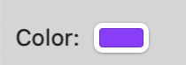
<Field id="exampleColorPicker" type="colorpicker" tooltip="Click this button to select a color.">
    <Label>Color:</Label>
    <CallbackMethod>ColorPickerPressed</CallbackMethod>
</Field>
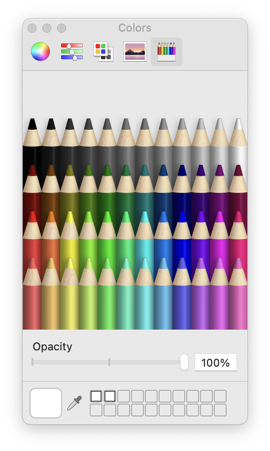
Color Picker fields allow your user to choose a color value. For example, you might provide a method for a user to select a color for an RGB LED device. When the user clicks the color button, Indigo will open the standard macOS color selector dialog.
After the user selects a color, the color's value will be passed back to your plugin as a *values_dict* value when the user executes/closes the configuration dialog. Note that the value provided is a standard RGB value as a space-delimited string. You are responsible for converting that value into the format you need like *#8000FF*.
The following table describes the attributes that are available for button fields.
| Attribute | Required | API Version | Notes |
|---|---|---|---|
alwaysUseInDialogHeightCalc |
No | 1.0 | For dialogs that contain hidden controls (see visibleBindingId and visibleBindingValue below), setting this attribute to true will force Indigo to take hidden controls into account when initially sizing the dialog box. This is useful when hidden controls become visible based on user input. |
enabledBindingId |
No | 1.0 (1.9) | If you want to conditionally enable/disable this field based on the value of a checkbox, set this value to the id of that field. API v1.9: You can also bind to a list field and this field will only be enabled if something is selected in the list. |
enabledBindingNegate |
No | 1.9 | Set this to "true" to negate the binding. So if the target binding field's value is true then the binding will be false. |
id |
Yes | 1.0 | This is a unique identifier for this Field within the context of this ConfigUI element. |
type |
Yes | 2.0 | This must be colorpicker. |
visibleBindingId |
No | 1.0 | If you want to conditionally show/hide this field based on the value of another field, set this value to the id of another field. If you set this, you must also include a visibleBindingValue |
visibleBindingValue |
No | 1.0 | If you specify a visibleBindingId, you must specify the value(s) here. For instance, if you are binding to a checkbox, setting this to false will mean the menu field is visible only when the checkbox is unchecked, and a true means the opposite. To make the field dependent on another list or menu, set this value to a comma separated list of option values (item1, item2). You can even bind it to the value in a text field, but that’s probably of limited use. Note: the string comparison is a contains - so if any option contains the specified string it will match. This offers some extra flexibility in defining dependency groups. |
Aside from the standard Label element, the colorPicker field also contains one other required element--the CallbackMethod element--which contains the name of a Python method in your code that’s called when the user executes your configuration dialog.
Validation Methods
When the user clicks on the save button, a validation method is automatically called with all the field/value pairs from your dialog. This table shows which method names are called based on the calling dialog type:
| Dialog Type | Method Signature | Parameters |
|---|---|---|
| device | validateDeviceConfigUi(self, valuesDict, typeId, devId) |
typeId - device type specified in the type attributedeviceId - the unique device ID for the device being edited (or 0 of it's a new device)*valuesDict* - the dictionary of values currently specified in the dialog |
| event | *validateEventConfigUi(self, valuesDict, typeId, eventId)* |
typeId - event type specified in the type attributeeventId - the unique event ID for the event being edited (or 0 of it's a new event)*valuesDict* - the dictionary of values currently specified in the dialog |
| action | validateActionConfigUi(self, valuesDict, typeId, deviceId) |
typeId - action type specified in the type attributedeviceId - the unique device ID for the device the user selected for the action if you specify a *deviceFilter**valuesDict* - the dictionary of values currently specified in the dialog |
| PluginConfig | *validatePrefsConfigUi(self, valuesDict)* |
*valuesDict* - the dictionary of values currently specified in the dialog |
Before the dialog is dismissed, this method will be called with a dictionary containing all the fields in the dialog. In your validation method, you’d do whatever validation is necessary. If everything validates correctly, then just return //True//:
def validateEventConfigUi(self, valuesDict, typeId, eventId):
    # Do your validation logic here
    return True
If you need to adjust the values, return the valuesDict with changes:
def validateEventConfigUi(self, valuesDict, typeId, eventId):
    # Do your validation logic here
    valuesDict["someKey"] = someNewValue
    return (True, valuesDict)
If you have errors that the user must correct, then you’ll return 3 things:
False, to indicate that validation failed- The values dictionary (with or without any changes)
- An error dictionary. The keys will be the fieldId and the value will be the error string. When the dialog receives this return, it will turn each field with an error red and add a tooltip to the label part of the field so the user can mouse over the label to see what’s wrong. API v1.4+: You can also add a special dictionary entry to your error message dictionary that will cause a sheet to drop down with the specified text. This will help the user identify what went wrong in the validation method. Just add a string with the key “showAlertText” to your error dictionary before return from your dialog.
def validateEventConfigUi(self, valuesDict, typeId, eventId):
    # Do your validation logic here
    errorDict = indigo.Dict()
    errorDict["someKey"] = "The value of this field must be from 1 to 10"
    errorDict["showAlertText"] = "Some very descriptive message to your user that will help them solve the validation problem."
    valuesDict["someOtherKey"] = someNewValue
    return (False, valuesDict, errorDict)
If you don't define these methods, then the default behavior is to have the validation calls always return True.
Validating serialport Fields
Because serialport fields are a bit special (they generate multiple visible fields), we've provided a helper method that you can use to make sure the user used the control correctly:
def validateDeviceConfigUi(self, valuesDict, typeId, devId):
    errorsDict = indigo.Dict()
    self.validateSerialPortUi(valuesDict, errorsDict, u"devicePortFieldId")

    # Put other config UI validation here -- add errors to errorDict.

    if len(errorsDict) > 0:
        # Some UI fields are not valid, return corrected fields and error messages (client
        # will not let the dialog window close).
        return (False, valuesDict, errorsDict)

    # User choices look good, so return True (client will then close the dialog window).
    return (True, valuesDict)
Notice that at the top of the validation method after we define the errorsDict, we call self.validateSerialPortUi(). This method will look for the fields that make up the specified field ("devicePortFieldId" in this case). It will make sure that a valid serial port is selected if it's a physical connection or that the address field is formatted properly if it's one of the network connections. If not, it will automatically add the appropriate errors to the errorsDict and will attempt to correct any URL prefix errors ("socket:%%%%" or "rfc2217:%%%%"). You can then continue to validate the rest of the fields in your dialog and use the length check on errorsDict to see if there were any errors discovered. If so, return False along with both dicts. If it's empty, just return true with the valuesDict.
Dialog Close Notification
So you know that when the user clicks the "Save" button in the dialog, your validation method will get called (if it exists). But, what if your dialog starts some separate thread (perhaps as a result of a button click), then the user clicks the "Cancel" button? You still need to know to stop the thread that's doing something, right? There is another, final method that's called at the very end of the dialog's lifecycle. It's very similar to the validation method, but with an additional parameter that tells you whether the user cancelled the dialog. Here are the various closed notification methods:
| Dialog Type | Method Signature |
|---|---|
| device | closedDeviceConfigUi(self, valuesDict, userCancelled, typeId, devId) |
| event | closedEventConfigUi(self, valuesDict, userCancelled, typeId, eventId) |
| action | closedActionConfigUi(self, valuesDict, userCancelled, typeId, actionId) |
| PluginConfig | closedPrefsConfigUi(self, valuesDict, userCancelled) |
The parameters are exactly the same as in the validation methods with the addition of userCancelled - which is a boolean. We're sure there are other reasons why one would need to know when the dialog closes so we wanted to make sure that the complete lifecycle of the dialog was exposed to you. NOTE: the parameters in this instance are all read-only. If you need to modify the valuesDict, for instance, you need to do it in the validate UI (which is fine since a cancel should never change anything).
PluginConfig.xml
We started the discussion of the Indigo XML by describing the ConfigUI element that’s present for Devices, Events, and Actions. But, how do you configure your plugin itself? For instance, let’s say your plugin requires a connection to some hardware interface, say something akin to the Insteon PowerLinc interface. How do you specify which serial port that interface is connected to?
The simple answer is that, just as there is a configuration interface for an Insteon hardware adaptor, your plugin has a configuration interface as well. The PluginConfig.xml file describes the UI to configure your plugin. The root element in that file is PluginConfig, and it contains exactly the same elements that the ConfigUI element described above does. Here’s an example:
<?xml version="1.0"?>
<PluginConfig>
    <SupportURL>http://www.yourdomain.com/plugin/config.html</SupportURL>

    [SNIP - lots of <Field> definitions]

</PluginConfig>
The IPH will handle retrieving saved preferences and passing them to your plugin as well as saving changed preferences to disk. Your preferences will be stored in a file in this directory:
/Library/Application Support/Perceptive Automation/Indigo 2025.2/Preferences/Plugins/
and it will be named by using your plugin’s ID (as defined by the CFBundleIdentifier in the Info.plist file). So, using the example Info.plist at the beginning of this doc, the pref file would be named:
com.yourdomain.plugin.indiPref
We write each plugin’s preferences into individual files so that it will be easier for you to help your users troubleshoot problems by deleting the prefs and starting over. We also write them into the standard Preferences folder so that when you upgrade your plugin or we upgrade Indigo, the preferences won’t get lost.
Custom HTML Config Dialogs
You can also implement your own custom configuration in HTML if you prefer. Rather than adding lots of <Field> definitions, you simply specify a <URL> element. The URL specified can either be a fully specified URL (protocol://host/path) or it may be a relative URL (/some/relative/path). If it's the later then Indigo will attempt to guess the best base URL. You would then handle those form requests using the built-in request handling mechanism discussed below. See the Example HTTP Responder plugin in the SDK for an example.
Devices.xml
One of the main components that a server plugin can define is a device. In Indigo, devices are the primary objects that users deal with. Lights, thermostats, sprinklers, I/O devices are all examples of device types. One of the biggest requests we get is to support the [name your favorite device]. Obviously, we can’t keep up, so the server plugin architecture was designed to allow you to add device support to Indigo.
The root element in the Devices.xml file is Devices. Contained in the Devices element are an unlimited number of Device elements that define the device types that your plugin will define. Each Device will contain a ConfigUI element to collect the specific configuration information for a device (note that you don’t need to include name, description, or typeId from the user - Indigo will collect those for you). Here are the specific attributes and elements that can be defined in a Device element:
Device Types
| Name | Type | Required | Notes | |
|---|---|---|---|---|
type |
Attribute | Yes | This must be one of: dimmer, relay, sensor, speedcontrol, thermostat, or custom. We’ll discuss each below. |
|
id |
Attribute | Yes | This is your plugins unique identifier for this device type. It must be unique in this plugin. | |
subType |
Attribute | No | This must be one of: kDimmerDeviceSubType, kRelayDeviceSubType, kSensorDeviceSubType. We’ll discuss each below. There are also several device SubType examples in the SDK. |
|
allowUserCreation |
Attribute | No | If set, the value must either be true or false (defaults to true). This attribute is discussed in more detail below. |
|
Name |
Element | Yes | This is the name of the device type that users will see when selecting the type in the Devices dialog. | |
ConfigUI |
Element | No | This is the custom UI for configuring the device. It’s optional, but in reality we can’t envision a device that needs no configuration. If the optional <ConfigUi> element is not used, the “Edit Device Settings…” button will be displayed, but disabled. You'll also need to manually set dev.configured = True and then dev.replaceOnServer() for the change to take effect. |
|
States |
Element | No | This element is used to describe the possible states for the device. For custom devices it is all available states. For subclassed devices it will describe any additional states for the device. See the description below for more details. |
<?xml version="1.0"?>
    <Device type="sensor" id="my_temp_sensor">
        <Name>Example Temperature Sensor Module</Name>
        <ConfigUI>
            <Field id="address" type="textfield" defaultValue="123">
                <Label>Module Address:</Label>
            </Field>
        </ConfigUI>
        <States>
            <State id="temperature">
                <ValueType>Integer</ValueType>
                <TriggerLabel>Temperature</TriggerLabel>
                <ControlPageLabel>Temperature</ControlPageLabel>
            </State>
        </States>
    </Device>
Device Sub-Types
| Category | SubType | Attribute(s) | Notes |
|---|---|---|---|
| Device | kDeviceSubType |
Amplifier, Automobile, Camera, Keypad, Mobile, Remote, Robot, Security, Speaker, Streaming, Television, Weather, Other | For example, indigo.kDeviceSubType.Amplifier |
| Dimmer | kDimmerDeviceSubType |
Blind, Bulb, ColorBulb, ColorDimmer, Dimmer, Fan, InLine, Outlet, Plugin, Value | For example, indigo.kDimmerDeviceSubType.Dimmer |
| Relay | kRelayDeviceSubType |
DoorBell, DoorController, GarageController, InLine, Lock, Outlet, Plugin, Siren, Switch | For example, indigo.kRelayDeviceSubType.Switch |
| Sensor | kSensorDeviceSubType |
Analog, Binary, CO, DoorWindow, GasLeak, GlassBreak, Humidity, Illuminance, Motion, Presence, Pressure, Smoke, Tamper, Temperature, UV, Vibration, Voltage, WaterLeak, Zone | For example, indigo.kSensorDeviceSubType.Temperature |
Note
There are no device sub-types for other built-in devices at this time.
In Devices.xml
<Device type="sensor" subType="kSensorDeviceSubType.Temperature" id="my_temp_sensor">

<Device type="sensor" subType="kSensorDeviceSubType.Temperature, ui=Outdoor Temperature" id="my_temp_sensor"
    <Name>Example Adjustable Sensor Module</Name>
...
In Python:
newdev = indigo.device.create(indigo.kRelayDeviceSubType.Plugin, deviceTypeId="Device1")
newdev.model = "Device 1 Model"
newdev.subModel = "Sub Model 1"
newdev.name = u"Device 1"
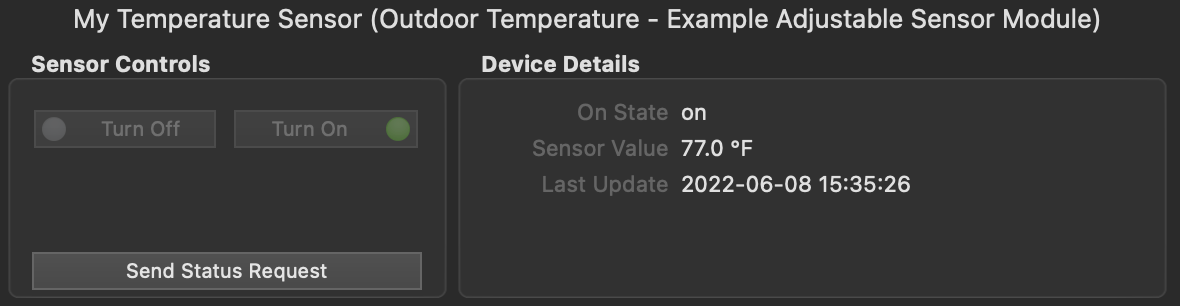
To get information on the device group:
When the allowUserCreation attribute is present and set to false, Indigo will not display the device model type when the user elects to create a new device (the "Model" dropdown will not contain the device type). This is especially useful for complex devices that have multiple sub-types that are set programmatically (but not created using the Device Factory approach). Your plugin may not support individual sub-types as stand-alone devices and, therefore, you wouldn't want users to be able to create them. The allowUserCreation attribute was introduced with Indigo version 2022.1.2 and API 3.1.
<Device type="sensor" subType="kSensorDeviceSubType.Temperature, ui=Outdoor Temperature" id="my_temp_sensor", allowUserCreation="false">
Important
Plugin developers should account for each devices' callbacks when implementing built-in device types -- even if you don't use all the callbacks within your plugin. For example, if your plugin implements the Speed Control device type, your plugin should include handlers for all the Speed Control callbacks -- such as turnOn, turnOff, or toggle. This is very important because these callbacks will still be exposed in the Indigo Client UI for things like Actions and Triggers. It's best to give users an indication that the callback won't do anything in your plugin by writing a warning to the Event log. Consult the SDK for more information on each device types' callbacks and examples of how to handle them.
Custom Device Type
The custom device type is special because it’s completely custom. Therefore, you must specify everything about the device - it’s states and their types (Number, String, List (enumeration), Boolean). So, here’s a simple example of the <States> element of a custom device, in this case a thermostat:
<States>
    <State id="temperature">
        <ValueType>Number</ValueType>
        <TriggerLabel>Temperature</TriggerLabel>
        <ControlPageLabel>Temperature</ControlPageLabel>
    </State>
    <State id="heatSetPoint">
        <ValueType>Number</ValueType>
        <TriggerLabel>Heat Setpoint</TriggerLabel>
        <ControlPageLabel>Heat Setpoint</ControlPageLabel>
    </State>
    <State id="coolSetPoint">
        <ValueType>Number</ValueType>
        <TriggerLabel>Cool Setpoint</TriggerLabel>
        <ControlPageLabel>Cool Setpoint</ControlPageLabel>
    </State>
    <State id="mode">
        <ValueType>
            <List>
                <Option value="off">Off</Option>
                <Option value="heatOn">Heat On</Option>
                <Option value="coolOn">Cool On</Option>
                <Option value="heatCoolOn">Heat and Cool On</Option>
            </List>
        </ValueType>
        <TriggerLabel>Operation Mode Changed</TriggerLabel>
        <TriggerLabelPrefix>Mode Changed to</TriggerLabelPrefix>
        <ControlPageLabel>Current Mode</ControlPageLabel>
        <ControlPageLabelPrefix>Mode is</ControlPageLabelPrefix>
    </State>
</States>
Each State listed in the States element will be available in various parts of the UI, including the “Device State Changed” Event dialog.
The State element has several attributes and elements that should be defined:
| Name | Type | Required | Notes |
|---|---|---|---|
id |
Attribute | Yes | This is a unique identifier for this State within the context of this Device element. IDs must follow the XML standard in terms of construction with one addition: they may not include periods ('.') - periods are reserved for internal use only. |
readonly |
Attribute | No | If you want this state to be read only, set this attribute to “YES”. For instance, as in this example, the temperature the thermostat is sensing isn’t user settable. (Currently unused but it may be used in the future) |
ValueType |
Element | Yes | This is the type of the state, which must be one of the following: Boolean, Number, List (enumeration constructed just like the <List> element of a <Field> as described above), String, and Separator (used only to visually group your states in the various popups). The <ValueType> element may also have an optional attribute if the value is Boolean//: boolType can be: “TrueFalse” (default), “OnOff”, “YesNo”, and “OneZero”. Example: <ValueType boolType=”OnOff”>Boolean</ValueType>// |
TriggerLabel |
Element | Yes | When selecting “Device State Changed” type trigger events, you can select your device in the resulting list. A popup below the device will list all of your States using this text. |
TriggerLabelPrefix |
Element | No | When defining an enumeration, trigger change label is usually going to need to be a bit different than just the trigger label (“Mode Changed to Heat” vs “Operation Mode Changed” - the former is to test a specific change, the latter will trigger on any change). To accomplish this, you can specify a prefix that’s prepended to the actual state value (with a space in between). See the example above. |
ControlPageLabel |
Element | Yes | In the Control Page Editor, when selecting “Device State” as the display type, then select your device, the next popup will show all your states using this text. |
ControlPageLabelPrefix |
Element | No | When defining an enumeration, the control page label is usually going to need to be a bit different (“Mode is Heat” vs “Current Mode” - the former will show whether a the state is true, the latter shows the state value). You can specify a prefix that’s prepended to the actual state value (with a space in between). See the example above. |
The ValueType element is particularly important - it controls what types of controls are presented to the user in the UI: an integer tells it to show greater than, less than, equal to, not equal to, etc and a way to enter a number (in the case of a trigger).
See the States section of the Devices Class page for details on how to set states once the IndigoServer understands the structure of your device's states.
Device Factory
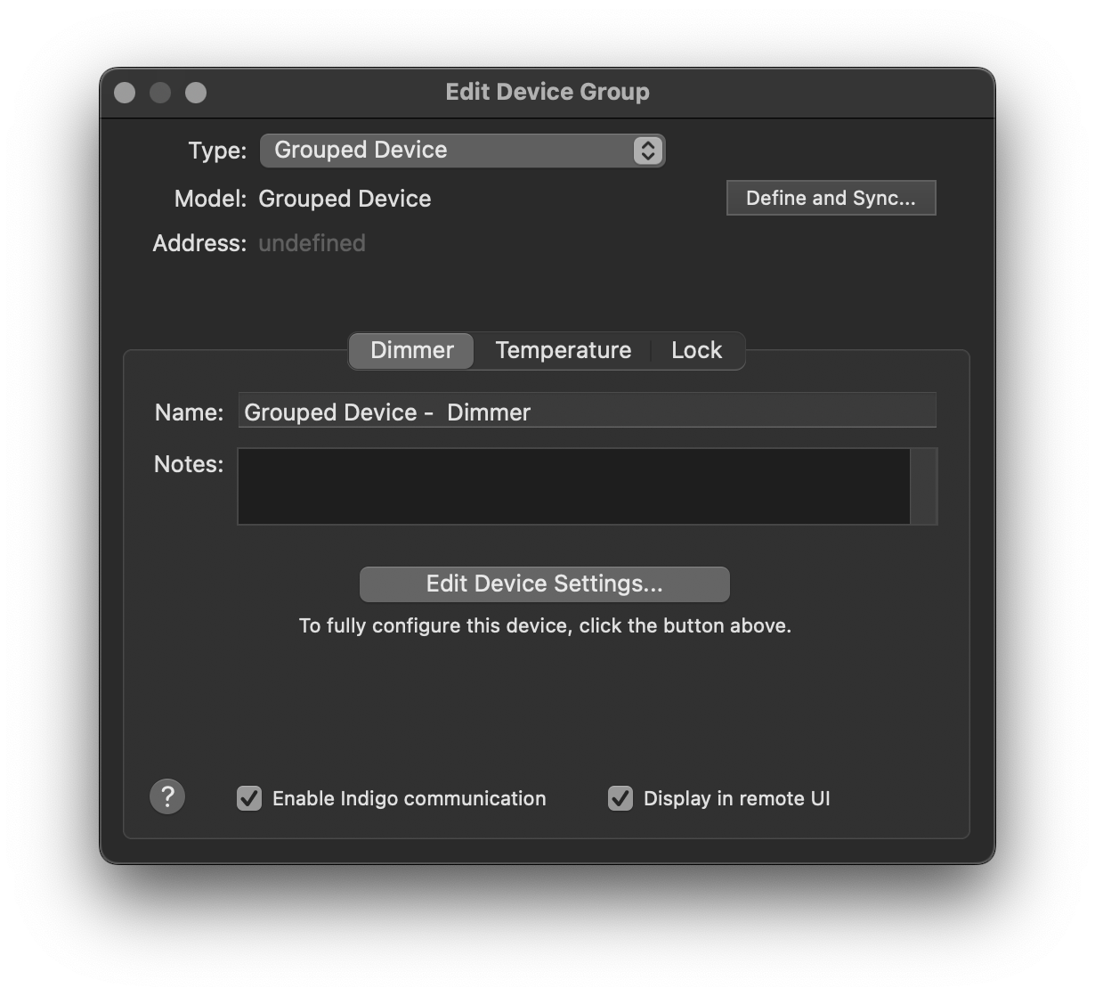
One way to create "multifunction" devices is to use Indigo's Device Factory method. Device Factory devices are defined by using a special <DeviceFactory> node in Devices.xml. A basic Device Factory device definition would look something like this:
<DeviceFactory>
    <Name>Device Factory Plugin Device Group</Name>
    <ButtonTitle>Create</ButtonTitle>
    <!-- A configUI is required for the device factory element. -->
    <ConfigUI>
        <Field id="label" type="label">
            <Label>You are not required to have settings here, but a configUI node is required. These will be stored in self.pluginPrefs and will apply to all grouped devices created with the plugin.</Label>
        </Field>
        <Field id="name" type="textfield">
            <Label>Name:</Label>
        </Field>
    </ConfigUI>
</DeviceFactory>
Note that when the <Device Factory> node is present, devices that include the subType attribute will not be presented to the user as individual device types when they elect to create a new plugin device (it's not possible to have a Device Factory implementation and individual plugin device definitions together). You define sub-devices like any other device type, with the addition of the subType attribute:
<DeviceFactory>
    <Name>Plugin Device Group</Name>
    <ButtonTitle>Create</ButtonTitle>
    <!-- A configUI is required for the device factory element. -->
    <ConfigUI>
        <Field id="label" type="label">
            <Label>You are not required to have settings here, but a configUI is required. These will be stored in self.pluginPrefs and will apply to all grouped devices created with the plugin.</Label>
        </Field>
        <Field id="name" type="textfield">
            <Label>Name:</Label>
        </Field>
    </ConfigUI>
</DeviceFactory>

<Device type="dimmer" id="my_dimmer_device" subType="kDimmerDeviceSubType.Dimmer" ui="Dimmer">
<!-- Note that devices can have their own configUIs -->
    <Name>Example Dimmer Module</Name>
    <ConfigUI>
        <Field id="label" type="label">
            <Label>You are not required to have a config UI for each individual device, however, creating a settings UI allows for settings that apply only to that group (when more than one grouped device is desired). These will be stored in dev.pluginProps.</Label>
        </Field>
        <Field id="name" type="textfield" hidden="false">
            <Label>Name:</Label>
        </Field>
        <Field id="setting" type="textfield" hidden="false">
            <Label>Setting:</Label>
        </Field>
    </ConfigUI>
    <States>
        <State id="state">
            <ValueType>String</ValueType>
            <TriggerLabel>State</TriggerLabel>
            <ControlPageLabel>State</ControlPageLabel>
        </State>
    </States>
</Device>

<Device type="sensor" id="my_sensor_device" subType="kSensorDeviceSubType.Temperature" ui="Outdoor Temperature">
    <Name>Example Adjustable Sensor Module</Name>
    <States>
        <State id="state">
            <ValueType>String</ValueType>
            <TriggerLabel>State</TriggerLabel>
            <ControlPageLabel>State</ControlPageLabel>
        </State>
    </States>
</Device>

<Device type="relay" id="my_lock_device" subType="kRelayDeviceSubType.Lock" ui="Lock">
    <Name>Example Lock Module</Name>
    <States>
        <State id="state">
            <ValueType>String</ValueType>
            <TriggerLabel>State</TriggerLabel>
            <ControlPageLabel>State</ControlPageLabel>
        </State>
    </States>
</Device>
Once the device definitions have been established, you can use your plugin code to create the device group. This function can be called from the validate_device_factory_ui()or closed_device_factory_ui() methods.
def create_the_device_group(self, my_name):
    """
    Convenience method for device creation. This could also be done in closed_device_factory_ui() for example. Note
    that some device props are read only even when you create them from scratch (i.e., dev.version) and some will
    be ignored if you try to set them (i.e., dev.description, dev.errorState).

    Note that `protocol`, `name` and `deviceTypeId` are all required with the `indigo.device.create()` method call.
    """
    self.debugLog("create_the_device_group called")

    # Create the first device in the group. Note that the ''deviceTypeId'' value matches the ''id'' we used in our ''Devices.xml'' definition.
    new_dev = indigo.device.create(protocol=indigo.kProtocol.Plugin, name=my_name, deviceTypeId="my_dimmer_device")
    new_dev.model = "Grouped Device"
    new_dev.subModel = "Dimmer"
    new_dev.name = f"{my_name} Dimmer"
    new_dev.replaceOnServer()

    # Add the group my_name setting to the props of device 1 for later use.
    new_props = new_dev.pluginProps
    new_props['name'] = my_name
    new_dev.replacePluginPropsOnServer(new_props)

    # Create the second device in the group. You can also add a state value here if desired.
    new_dev = indigo.device.create(protocol=indigo.kProtocol.Plugin, name=my_name, deviceTypeId="my_sensor_device")
    new_dev.model = "Grouped Device"
    new_dev.subModel = "Temperature"
    new_dev.name = f"{my_name} Temperature"
    new_dev.replaceOnServer()
    new_dev.updateStateOnServer('state', value="Some value.")

    # You can also create devices that don't have corresponding device parameters established in Devices.xml.
    new_dev = indigo.device.create(protocol=indigo.kProtocol.Plugin, name=my_name, deviceTypeId="my_lock_device")
    new_dev.model = "Grouped Device"
    new_dev.subModel = "Lock"
    new_dev.name = f"{my_name} Lock"
    new_dev.replaceOnServer()
Important
You are responsible for catching all the mandatory methods for the devices you create. The Device Factory method does not create them for you.
For another option to create Device Factory devices, check out the example in the Indigo SDK.
Events.xml
The XML in this file describes all events that your plugin will generate for use in Indigo. Your users will use these in the Trigger Events dialog just like any of the built-in Indigo events (like Power Failure, Email Received, etc). Device State Changed events are handled by the <States> defined in the <Device> elements described above, but your plugin can offer other types of events, including update notifications, battery low notifications, button press notifications, etc.
Here’s a very small Events.xml file that just defines a plugin update event:
<?xml version="1.0"?>
<Events>
    <SupportURL>http://www.yourdomain.com/plugin/pluginEvents.html</SupportURL>
    <Event id="updateAvailable">
        <Name>Plugin Update Available</Name>
    </Event>
</Events>
As you can see, your <Event> elements can define a <SupportURL> element as well - the trigger events dialog now has a help button on it and if one of your events is selected clicking on the help button will take your user to the specified URL. If you don’t specify one then the default help page for all trigger events will show. You can specify an Event to be a separator in your event list so that when they're displayed in the UI there is a visual separation. Simply insert an Event defined like this between two other Event elements:
<Event id="sep1"/>
While you don't have to include any elements, the id still must be unique.
Here’s how to construct your <Event> elements:
| Name | Type | Required | Notes |
|---|---|---|---|
id |
Attribute | Yes | This is a unique id for the event in this Events.xml file. |
Name |
Element | Yes | This is the text that’s shown in the trigger event dialog that represents this event. |
ConfigUI |
Element | No | If your event requires any configuration, you can specify a <ConfigUI> element that’s defined exactly as above. |
Actions.xml
Your plugin will also very likely define some actions that a user can take. This is where you define those. Here’s a simple example:
<?xml version="1.0"?>
<Actions>
    <SupportURL>http://www.yourdomain.com/plugin/pluginActions.html</SupportURL>
    <Action id="resetInterface">
        <Name>Reset Interface</Name>
        <CallbackMethod>resetInterface</CallbackMethod>
    </Action>
</Actions>
As with <Event>, your <Action> elements can define a <SupportURL> element as well - the actions dialog now has a help button on it and if one of your actions is selected clicking on the help button will take your user to the specified URL. If you don’t specify one then the default help page for all actions will show.
You can specify an Action item field to be a label within a ConfigUI in your action list when you want to include some text -- for example, to explain what users should enter into a text field. Label tags require a unique id and the type should be set to label. Labels do not require any other elements.
You can specify an Action item to be a separator in your action list so that when they're displayed in the UI there is a visual separation. Simply insert an Action defined like this between two other Action elements: While you don't have to include any elements, the id still must be unique.
<Action id="sep1"/>
For a full description of all the different XML conventions that Indigo uses, see this page.
When defining a full plugin action, a few elements are required. Here’s how you construct your <Action> elements in //Actions.xml//:
| Name | Type | Required | Notes | ||
|---|---|---|---|---|---|
id |
Attribute | Yes | This is a unique id for the event in this Actions.xml file. |
||
deviceFilter |
Attribute | No | If present, a popup list of devices that match the specified device filter will be shown in the UI. Many actions may not need any configuration beyond a device selection so we've enabled you to specify that a device must be selected and passed to the action's CallbackMethod. This will avoid the necessity to create a ConfigUI element with just a device popup. |
||
uiPath |
Attribute | No | Added in API v1.4. You can specify where in the menu hierarchy your action will be placed. By default, Indigo will create a submenu at the bottom of the Actions list and put your actions there. If you specify "DeviceActions", Indigo will create a submenu on the Device Actions menu and put your actions there. If you specify "NotificationActions", Indigo will insert your action n the Notification Actions menu without a submenu (be sure to name your action appropriately so that it's clear what it does). Added in API v2.0: use "hidden" to hide the action in the UI. Useful for actions that are only intended to be used from scripts/plugins (an API of sorts). | ||
Name |
Element | Yes* | This is the text that’s shown in the actions dialog that represents this action. Name is not required for labels and separators. |
||
CallbackMethod |
Element | Yes* | This is the name of the method that implements the action in your code. CallbackMethod is not required for labels and separators. |
||
ConfigUI |
Element | No | If your action requires any configuration (as most will), you can specify a <ConfigUI> element that’s defined exactly as above. |
When the Action is fired in Indigo, the callback method will be called and an Indigo dictionary will be passed with information about how to handle the call. In the example below, the action payload will contain the necessary things to implement the call. Notice the call to action.props.get() in the Python callback below, which will pull the appropriate value from the specified key (message, type, etc.) using the standard Python dictionary get() method.
Here is a sample action dict sent to a plugin:
configured : True
delayAmount : 900  <-- Read only; currently not used
description : redraw one chart  <-- Taken from the Actions.xml <NAME> element.
props : com.foo.indigoplugin.my_plugin : (dict)
     config_prop_1 : 123 (integer)
     config_prop_2 : true (bool)
     config_prop_3 : "baz" (string)
replaceExisting : True  <-- Read only; currently not used
textToSpeak :
Here is the code that implements the Write to Log action defined in the Action Collection plugin:
def writeToLog(self, action):
    # call for variable substitution on the message field they entered
    theMessage = self.substitute(action.props.get("message", ""))
    # set the type for the message if they configured one
    theType = action.props.get("type")
    # debugging - show the message if debugging is enabled
    self.debugLog(u"Write to log: " + theMessage)
    # if they entered a type, log the message with it, otherwise log the message without a type
    if theType:
        indigo.server.log(theMessage,type=theType)
    else:
        indigo.server.log(theMessage)
Notice the call to self.substitute() - this method is defined in the plugin base class. If your user inserts %%v:12345%% into their string where 12345 is the ID of a variable, the call will return a string with all variable occurrences substituted. If your user inserts %%d:12345:someStateId%% into their string where 12345 is the ID of a device and someStateId is a valid state identifier, the call will return a string with all device state occurrences substituted. See the substitutions docs for more information.
Your plugin actions can return any Python "primitive" value to users when they call your action
with the executeAction method (a return value is not required). The return value can
be any one of the following object types:
- None
None, - booleans
bool, - integers
int(), - floats
float(), - strings
str(), - Indigo Dicts
indigo.Dict(), - Indigo Lists
indigo.List().
Your plugin action may also receive an optional callerWaitingForResult parameter which is a request for your plugin to block until it can complete its tasks (and also return a response).
def actionSomeXmlDefineActionCallback(self, action, dev, callerWaitingForResult, event_data=None):
    # do your typical action stuff here
    # note: event_data contains a dictionary of information about what caused the event to fire
    return some_value
Instead, if the plugin cannot immediately return a result for the action (because it has to communicate with hardware, for example), then it can can acquire a completion handler callback function that can be executed later (asynchronously) in another thread.
The pattern would then be something like:
def actionSomeXmlDefineActionCallback(self, action, dev, callerWaitingForResult):
   completeHandler = None
   if callerWaitingForResult:   # only acquire the completion handler if caller is wanting a result
      completeHandler = indigo.acquireCallbackCompleteHandler()

   self.pluginsActionQueue.put((action, dev, completeHandler))
   # Note self.pluginsActionQueue is not implemented by the base plugin and is just an example
   # of how one might pass the action and completeHandler to another thread using a queue.

def anotherThreadQueueHandlerFunc(self)
   try:
      (action, dev, completeHandler) = self.pluginsActionQueue.get(True, 60)

      # Process the requested action here. This can block and take a long
      # time without impacting UI usability because this method would be
      # called from another thread.

      # Upon completion you can return the result to the original action caller
      # via:
      if completeHandler is not None:
         completeHandler.returnResult("success performing action")
   except Exception, exc:
      # If there was an exception performing the action (hardware not available, etc.)
      # then the exception can be returned to the original action caller via:
      if completeHandler is not None:
         completeHandler.returnException(exc)
So, rather than return a value from the actual callback, you request a callback completion handler from the server. You then can queue up data, including the handler object, so that some other async thread can perform whatever communication, calculation, etc., is needed and use the completion handler to return the result. As shown in the example above, you can also return an exception which will be thrown in the requesting process if necessary.
Note: To increase the value of your plugin, you should ensure that you test and document the necessary information so that Python scripters can script your plugin's actions. You should include information on the parameters your action will expect to receive and what your action will return (if anything) when the action is called. Here is an example that shows how a scripter can tell the Timers plugin to restart a timer. You can provide that information in a relatively straight-forward way in your plugin's documentation as we've done with our plugins (check the Airfoil and Timers and Pesters docs for examples). You shouldn't really have to do much - but you should test each action. Sometimes you can make assumptions about the data that you get from your action's ConfigUI that you may want to change - for instance you may expect data when it would be advantageous to not include it (optional data) from a scripters perspective.
MenuItems.xml
Your plugin may also define menu items, which will be shown at the bottom of your plugin’s sub-menu on the Plugins menu - they will be the last thing in the menu unless you also include scripts in the Menu Items folder of your plugin’s bundle. If there are scripts there, they will be last, and a separator will be placed between the menu items defined in this XML file and any script files.
Here’s a sample MenuItems.xml file:
<?xml version="1.0"?>
<MenuItems>
    <MenuItem id="menu1">
        <Name>Reset Interface</Name>
        <CallbackMethod>resetInterface</CallbackMethod>
    </MenuItem>
    <MenuItem id="menu2">
        <Name>Check for Updates</Name>
        <CallbackMethod>checkForUpdates</CallbackMethod>
    </MenuItem>
    <MenuItem id="menu3">
        <Name>Turn Off Light...</Name>
        <CallbackMethod>turnOffLight</CallbackMethod>
        <ButtonTitle>Turn Off</ButtonTitle>
        <ConfigUI>
        <Field id="targetDevice" type="menu">
            <Label>Light:</Label>
            <List class="self" filter="self.myLightType" method="getDynamicList" />
        </Field>
        </ConfigUI>
    </MenuItem>
    <!-- Added in v1.2 -->
    <MenuItem id="menu4">
        <Name>Execute Some Action</Name>
        <ConfigUI actionId="someAction"/>
    </MenuItem>
</MenuItems>
It’s pretty straight-forward. The MenuItems element will contain multiple <MenuItem> elements. Here’s how to construct a //<MenuItem>//:
| Name | Type | Required | API Version | Notes | |
|---|---|---|---|---|---|
id |
Attribute | Yes | 1.0 | This is a unique id for the menu item in this file. | |
Name |
Element | Yes | 1.0 | This is the text that’s shown in your plugin’s sub-menu. | |
CallbackMethod |
Element | No | 1.0 (1.1) | This is the name of the method defined in your plugin that will be called when your user selects this menu item. API v1.1: If you specify a |
|
ConfigUI |
Element | No | 1.1 (1.2) | If you want a menu to open an associated dialog, you can include a standard ConfigUI element (see Configuration Dialogs above for details). API v1.2: You may also specify an actionId attribute on this element with the id of one of your actions and that action UI will be executed rather than having to specify the UI itself. If it requires a device ID that will be added at the top of the dialog. Ex: <ConfigUI actionId="actionIdHere"/> |
|
ButtonTitle |
Element | No | 1.1 | If you have a ConfigUI element and a CallbackMethod, you can add this element to specify the title used on the button that executes the dialog. By default it's "Execute". |
Here's an example of a menu item method definition in your plugin.py file for the "Check for Updates" menu item above:
def checkForUpdates(self):
    indigo.server.log(u"checkForUpdates called")
    # Do the actual work here to see if there are any updates
As of API v1.1 you can have your menu item open a dialog which will allow you to gather input from a user before executing the action. Just add a <ConfigUI> element to your MenuItem definition and define that dialog just like any other. There are a couple of differences between this dialog and other dialogs. First, the CallbackMethod for menu items will be used rather than a validation method. It will, however, operate in much the same way. If you specify a CallbackMethod then it will get called with the valuesDict and the menu item's ID. You can return True, which will cause the dialog to close, or return false with an error dictionary which will mark the invalid fields just like the validation method would. You also have the option of adding a ButtonTitle element - which will allow you to change the name of the button (it defaults to Execute).
If you don't specify a CallbackMethod then the dialog will not have Execute and Cancel buttons but rather a single Close button. Why? We wanted to allow you the flexibility of making a dialog perform multiple actions if you like using button field types within the dialog itself. When doing that it would be awkward to have an Execute button that didn't really do anything.
Whenever a user executes a menu item that contains a configuration dialog, it’s running as if it’s the first time the menu item is run (default values will always be used if present). Any values the user enters will be discarded after the menu item action is run. In other words, the next time the dialog is opened, default values will be used even if a user changed that value the last time the menu item was run. If a field doesn't specify a default value, the field will be empty each time the dialog is opened.
Here's an example of a menu item method definition in your plugin.py file for the "Turn Off Light" menu item above:
def turnOffLight(self, valuesDict, typeId):
    indigo.server.log(f"Turning off light: {valuesDict["targetDevice"]}")
    # perform the action here. If there are errors in any of the fields then
    # you can return (False, valuesDict, errorsDict) just like a validation
    # method and the dialog won't close and will show the errors. If you
    # return True then the dialog will close when the method completes.
    errorsDict = indigo.Dict()
    return (True, valuesDict, errorsDict)
get_menu_action_config_ui_values
As noted above, a menu item config dialog will open as if it's being opened for the first time. However, if you would like values entered into the dialog to be persistent, you can load those values using the built-in get_menu_action_config_ui_values callback. Your plugin is responsible for storing and retrieving the values for the dialog yourself. How you store those values is up to you (you could save them to a file or store them in a hidden plugin configuration field, for example). Then, you can load them into the config dialog using get_menu_action_config_ui_values which will be called automatically if it exists:
def get_menu_action_config_ui_values(self, menu_id):
        menu_items = indigo.Dict()
        if menu_id == "my_menu_id":
            menu_items['foobar'] = "my stored value"
        return menu_items
Custom HTML Menu Item Dialogs
You can also implement your own custom menu item form in HTML if you prefer. Rather than adding <CallbackMethod> and <ConfigUI> definitions, you simply specify a <URL> element. The URL specified can either be a fully specified URL (protocol://host/path) or it may be a relative URL (/some/relative/path). If it's the latter, then Indigo will attempt to guess the best base URL. You would then handle those form requests using the built-in request handling mechanism discussed below. See the Example HTTP Responder plugin in the SDK for an example.
SupportURL Elements
Anywhere you can specify a <SupportURL> element, the value can be either a full URL or a relative URL. If it's relative, then Indigo will attempt to guess the best base URL. You can use this to supply static HTML files or dynamic help provided through the HTTP processing API discussed below.